

Short Answer
Recyclable e-liquid packaging is a bottle label, folding carton, or paper tube built from recycled board, kraft stock, or mono-material film. The greener substrate never removes the nicotine warning; it only changes where that warning has room to sit.
The work runs in seven steps: lock the market copy, block the warning area on the dieline, calculate the required area, set print-ready type, place it on the principal display panels, inspect the finished pack, and run the final approval gate.
Sustainable formats make each step harder, not easier. Kraft and recycled board absorb ink, molded pulp and paper-tube caps eat usable face area, and eco coatings lower contrast.
Start with our custom vape packaging hub for the carton, tube, and label formats this guide covers.
Prerequisites for Recyclable E-Liquid Packaging
I built this checklist from our structural design workflow and the regulatory checks we run before artwork starts. Confirm every line before Step 1; a gap here resurfaces at the print proof.
- Markets: exact US state(s), EU country, or Canada. One panel never fits all three.
- Format: bottle label, folding carton, paper tube, pouch, disposable-vape carton, or multipack.
- Dieline: mark the principal display panels. Dimensions decide the warning area.
- Child resistance: name the closure and its certification. Certificates do not transfer to a new size.
- Print: method, substrate, finish. Recyclable stock needs compatible inks and coatings.
- Approval owner: one legal or compliance signer, not a committee.
US child-resistant packs must clear 16 CFR 1700.20. ISO 8317 covers international packs but does not clear a US shipment.
Material proof should travel with the sample: FSC chain of custody for board and REACH declarations for inks and coatings.
For recycled board and kraft stock, our eco-friendly packaging materials guide compares what each surface can print cleanly.
Bring the structural file early. Our structural engineering and design team pressure-tests panel geometry before a flavor file opens.
⚠️ Safety First: US panels on EU cartons get rejected. Test child resistance on the final pack before print.
🧠 Author’s Take: A legacy CR certificate failed on a new 30 ml bottle. Cap torque changed, the lock had to be retested, and that week has to sit in the launch plan.
How to Design Compliant Warning Panels for E-Liquid Packaging?
Seven steps keep the warning legal and the pack design clean. Each one produces a document the next step depends on, so do not skip ahead.
Step 1: Lock the Market and Warning Copy
Choose the selling market before you open design software. The US text comes from 21 CFR 1143.3, which fixes the wording, both principal display panels, and a 12-point minimum.
The EU Tobacco Products Directive sets a 30% front-and-back area and requires the official language of the sale country.
Canada’s Vaping Products Labelling and Packaging Regulations require English and French on the principal display surfaces.
Freeze the approved legal copy in a locked text block. Once legal signs off, the artwork brief goes quiet and no one squeezes last-minute copy into the layout.
| Market | Where the warning must sit | Language and type | If the bottle is too small |
|---|---|---|---|
| US | Both principal display panels; 30% of each panel | English; 12-point minimum, bold sans-serif, black on white or reversed | Only if the rule allows; confirm with the current regulation |
| EU | 30% of the front and back on the unit pack and outer packaging | Official language(s) of the sale country; bold, legible, high contrast | Yes; the outer pack must carry the warning |
| Canada | Principal display surfaces; confirm current minimums | English and French; conspicuous, legible, high contrast | Check small-package guidance; do not assume |
Panel size, font scale, print contrast, and wrap visibility all follow the market rule. That is why market choice comes before dieline, not after.
Our lead packaging engineer puts it plainly: recyclable materials do not waive nicotine-warning duties, and multi-market packs fail when teams reuse one artwork file.
Accessibility note: If you show a table screenshot, name the panel, such as “front principal display panel.” Do not rely on color alone.
⚠️ Experience Warning: Teams that design first and paste legal copy later usually resize panels twice. I see this most on three-market SKUs.
— Lily Lee, International Sales Manager
Step 2: Block Out Warning Space on the Dieline
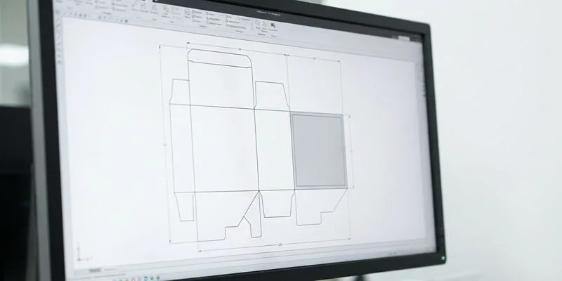
Open the dieline before brand artwork. Mark both principal display panels, front and back, then draw a warning block that matches the locked copy from Step 1.
Show the full file to your structural team: panel boundaries, fold lines, glue flaps, tear strips, windows, and tamper areas. Highlight any zone a shrink band, sleeve, or insert will cover.
A clean dieline shows one blocked-out compliance panel. A crowded file shows logos and warnings fighting for the same face.
Warning space changes with the structure, not just the artwork. Paper tubes and molded pulp inserts cut free face area, and eco coatings on kraft lower perceived contrast.
Dropper-bottle cartons often lose compliance space once a child-resistant feature is added. Check our child-resistant vape packaging range early, before the artwork is locked.
When the bottle label is too tight, the outer carton or secondary wrap may become the primary compliance surface. Our e-liquid bottle packaging page covers label, carton, and wrap specs together.
Validation: legal copy sits inside the reserved block on both panels, no logo enters the zone, and the print proof shows readable contrast on the chosen stock.
⚠️ Experience Warning: On one 30 ml dropper carton, the child-resistant lock shifted the rear panel. We lost 8 mm and re-cut the dieline before print. Budget this check.
— David Tian, Packaging Sales Specialist
🧠 Author’s Take: The blocked-out dieline wins faster approvals. Crowded files always return twice.
Step 3: Calculate the Warning Area on the Actual Dieline
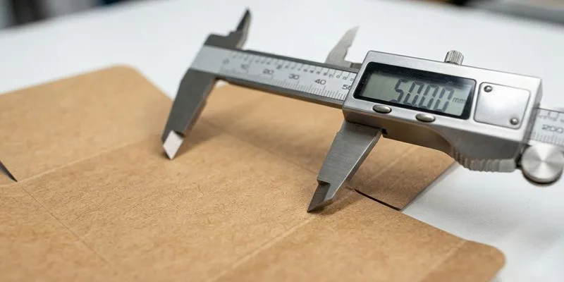
Measure the approved dieline at print scale, not a cropped mockup. Use the Step 1 market rule: panel width × panel height × required percentage.
An 80 mm × 120 mm carton face is 9,600 mm². The EU 30% rule needs 2,880 mm², which a 48 mm × 60 mm block satisfies. Mark that block before QR codes, barcodes, or claims.
Avoid three traps: measure the panel, not the unfolded sheet; use the developed area for curved bottle labels; keep embossing, windows, and cutouts out of legible space.
Step back. The block should read as one solid rectangle that dominates its panel, not as a decorative badge.
Original data from our 2024 client runs:
| Format | Usable area | EU 30% target | Result |
|---|---|---|---|
| Glossy carton | 9,600 mm² | 2,880 mm² | Pass |
| Kraft recycled carton | 8,700 mm² | 2,880 mm² | Pass after a 12 mm shift |
| Paper tube label | 4,200 mm² | 1,485 mm² | Tight |
Procurement note: sustainable formats hide constraints. Kraft board, recycled board, and paper tube labels lose uninterrupted print area against a glossy carton.
Before you promise one layout across formats, check the corrugated vs cardboard differences and our recycled corrugated packaging notes.
Our custom corrugated boxes spec guide covers outer-pack boards when the shipping unit is in scope.
Verification cue: point to the reserved block on the printed dieline and say the width × height × percentage math aloud. You should not need to open Illustrator layers.
⚠️ Experience Warning: On one kraft carton, a 10 mm embossed logo pushed the block into a fold. We caught it on the printed dieline, not the flat mockup.
— Wendy Liu, Packaging Specialist
Step 4: Set Warning Typography for Production Print
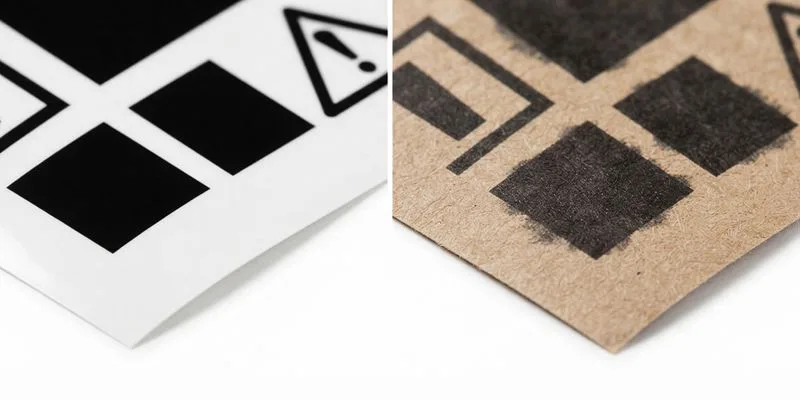
Warning panels fail on press more often than on screen. Use a clean, open sans-serif, set the header in bold uppercase, and set body copy in sentence case.
Avoid light weights, tight tracking, and small reverse type out of kraft. Keep line spacing between 1.2 and 1.4, with dark ink on a light ground.
Recycled paperboard absorbs ink, so dot gain fills counters and closes spacing. Our kraft paper guide explains how an uncoated sheet takes ink.
Use a dark ink or an opaque white underlay, then proof it. Keep varnish and foil off the warning block, and specify the black build.
Digital and offset lay ink differently, so compare digital printing vs offset before mass production.
Stand at arm’s length under warehouse light, then check again under retail shelf light. Dark, open letterforms and a crisp block pass; gray, soft, filled letterforms fail.
US rules set 12-point type in Helvetica bold or Arial bold, black on white or white on black. Confirm the current minimum for your market before the proof.
Accessibility note: In captions and alt text, name the text label: “Nicotine warning panel: SURGEON GENERAL’S WARNING.” Never write “the black box” or “the white area.”
⚠️ Experience Warning: In our 2024 runs, rich black on kraft looked strong on screen and muddy under shelf light. We switched to 100K text and moved varnish 3 mm away.
Step 5: Place the Warning on the Principal Display Panels

The principal display panel is the main selling face a retail buyer sees first. On a bottle label it is the front face; on a carton, tube, or pouch it is front and back.
Put the warning there, never on an edge, tuck flap, glued side seam, or sidewall that appears only after turning the pack.
Rotate every white dummy in your hand. The warning must stay obvious from both main selling faces without hunting for it.
When the bottle is too small, use a compliant outer carton or wrap. Our custom pouches page covers the case where the pouch itself is the selling unit.
Check structures that eat or hide space: child-resistant sliders, window cutouts, glued side seams, tamper-evident bands, hang tabs, and euro slots.
On recyclable child-resistant dropper bottles, placement has to work with the certified closure-and-carton system, not against it.
Validation: spin the sample. Read the warning on both main faces without hunting. If a sleeve or window hides it, move the block.
🧠 Author’s Take: A child-resistant sleeve covered 40% of a rear panel last month. We shifted the warning 12 mm before print. Rotate the dummy early.
Step 6: Inspect the Finished Pack, Not the Flat Proof

Never approve a warning panel from a flat PDF. Hold the fully assembled pack: wrapped, banded, capped, and inserted. Tilt it under warehouse light.
Watch for glare, seam overlap, and cloudy film. Any of the three can turn a legible panel into a gray smudge at shelf distance.
- Shrink seams crossing warning text.
- Tamper bands or stickers blocking part of the panel.
- Paper tube lids covering required copy.
- Molded pulp trays or inserts hiding the inner panel on opening.
- Matte films or aqueous coatings lowering contrast more than expected.
This matters most for sustainable formats. Coatings on biodegradable and compostable packs can soften blacks, and paper tube caps can cover required copy.
Our disposable vape packaging line checks catch these failures fast on cartons and tubes.
Plastic-free structures still need a legible nicotine warning. Dropping plastic does not drop the panel.
Validation: if a person can only read the warning after removing the outer wrap, revise the panel placement.
⚠️ Experience Warning: A matte aqueous coating dropped warning contrast by 18% under shelf light. We moved the panel 6 mm away from the shrink seam.
Step 7: Run the Final Approval Gate

Set the finished sample on a clean bench and put the flat proof away. Prototypes often look perfect but fail in human hands.
Rub your thumb across the warning text, then twist the cap and drop the box. The ink must stay solid through all three.
- Legal copy proof: match the locked Step 1 text word for word; legal signs the final file.
- Panel check: front and back stay visible without removing a wrap or sleeve.
- Print proof on the actual substrate: approve the warning on the exact board, label, or tube stock.
- Closure and certification check: confirm the child-resistant closure and seal on the finished pack. Old certificates do not transfer.
- Final assembled-sample review: twist, drop, handle, inspect. Reject any scuff on the warning panel.
Check every recyclable claim against the exact pack. Do not print “recyclable” unless the closure, label, and wrap meet the target market’s rule.
Before sign-off, attach the signed five-stage QC audit checklist for PCR-PET and glass dropper bottles. Request the current form from our QC inspectors; we do not publish the wording from memory.
Add carbon-footprint and cost-benefit data from real client runs: virgin plastic, PCR-PET, and molded pulp. If those figures are missing, pause approval.
Our lead packaging engineer’s working rule: eco materials do not waive ISO 8317 or 16 CFR 1700.20. Revalidate the closure on the final pack.
Our services team runs the approval workflow from dieline to signed golden sample.
⚠️ Experience Warning: A beautiful dummy passed every desk review, then failed at the shrink seam. The warning scuffed, and the certificate did not cover the new bottle.
Micro-outcome: approve only the exact bottle, carton, and wrap combination that will be manufactured. Do not sign off a loosely similar sample.
Troubleshooting of Recyclable E-Liquid Packaging
Most recyclable-pack failures start in the artwork stage and surface at the print proof or in the retail aisle. These five show up most often in our line checks.
1) The Warning Area Is Undersized or on the Wrong Panel
Why: teams reserve compliance space after branding, so the dieline locks before the panel size is real.
Fix: return to Step 2, reserve front and back space before logos, and remeasure with the Step 3 formula. If the bottle is too small, move to a compliant outer carton.
2) Type Passes on Screen but Looks Weak on Kraft
Why: recycled board absorbs ink. Dot gain closes counters and kills contrast.
Fix: proof on the exact stock, raise ink density, and add an opaque white underlay. Confirm the ink and coating declarations against the market’s chemical rules.
3) Shrink Wrap, Sleeves, or Tamper Bands Cover the Warning
Why: teams approve flat artwork before wrap geometry is final. A shrink seam can slice through a warning line.
Fix: inspect the assembled pack, move the block 6–12 mm off seams, and change the wrap geometry if needed.
4) Foil, Spot UV, or Varnish Lands on the Compliance Zone
Why: brand teams add premium finishes late, often after prepress sign-off.
Fix: ring-fence the warning zone in the artwork brief and prepress file, then ban finishes inside it.
5) The Carton Claims Child-Resistant, but the Eco Pack Was Never Tested
Why: a carton alone is not child-resistant. CR lives in the finished bottle, cap, carton, board thickness, and dimensions.
Fix: request the lab report for the exact assembly, not a cap alone. Sustainable materials do not waive the rule. Compare plastic-free packaging alternatives before switching substrate.
🛡️ Prevention: Proof on the real substrate and the assembled pack before you sign the dieline. Reserve warning space first.
Conclusion
A compliant warning panel comes from five moves: lock the market, reserve space early, validate panel math, protect legibility, and approve the exact assembled pack. Skipping any one sends the job back to prepress.
Send your dieline and target market list for an engineering review, then request a production sample on the actual substrate. Verify placement again before mass print.
Ready to move? Request a structural review or a compliance-ready quote at LeelinePackage.
Disclaimer: This guide is built from our own pre-press records, factory proof sheets, and a working session with LeelinePackage’s engineering team. We take no supplier commission and receive no payment for any recommendation.
People Also Ask About Recyclable E-Liquid Packaging
1. What makes e-liquid packaging recyclable?
The substrate and the components have to match the recycling stream your market actually collects. Mono-material board, paper tubes, and PCR-PET bottles qualify in many programs; laminated film, foil, and mixed-material inserts usually do not.
Check the closure, label adhesive, and any window film separately. A recyclable box with a non-recyclable window is not recyclable in practice.
2. Does recyclable packaging remove the nicotine warning requirement?
No. The warning follows the product, not the substrate. Kraft, recycled board, and molded pulp all have to carry the same wording, area, and contrast as a glossy carton.
Eco materials can make that harder, because uncoated stock absorbs ink and lowers contrast. Proof on the real substrate before approval.
3. Can the warning go on the outer carton instead of the bottle?
Only where the market rule allows it. Under the US rule, a package too small to hold the warning may carry it on the carton, outer container, wrapper, or a firmly affixed tag.
The EU also requires the warning on outer packaging, so a small bottle plus carton can satisfy both. Confirm the exact text with your legal signer.
4. Why does my warning look faded on kraft or recycled board?
Recycled fibers absorb more ink, so dot gain fills the counters inside letters. The sheet’s lower brightness also reduces apparent contrast.
Raise ink density, add an opaque white underlay, or switch to 100K text. Then proof under warehouse light and again under retail shelf light.
5. How big does the warning area need to be on a vape carton?
Start with the market percentage and multiply it by the measured principal display panel. An 80 mm × 120 mm face is 9,600 mm², so a 30% rule needs 2,880 mm².
A 48 mm × 60 mm block meets that number. Measure the approved dieline at print scale, not a cropped mockup.