Stand out on shelves
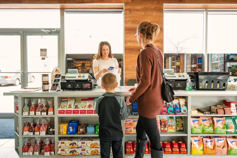
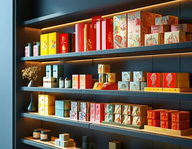
A shelf is won in a second. A pack that is unmistakable stops the eye, stands apart from the one beside it and makes the product easy to find again — so the brand is remembered, not just seen.

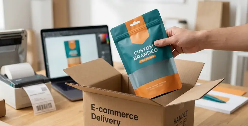
Transform your brand vision into shelf-ready packaging artwork — a visual hierarchy that converts on the shelf and prints exactly as approved, so the approved box is the one that ships.
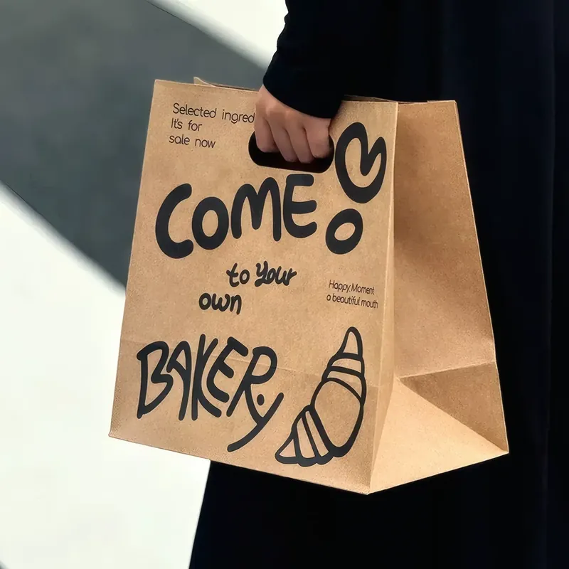
In a crowded market the pack is the first touchpoint — what it says, how it opens and what it costs to ship decide whether a product is picked up, kept and reordered.
A shelf is won in a second. A pack that is unmistakable stops the eye, stands apart from the one beside it and makes the product easy to find again — so the brand is remembered, not just seen.
The open is part of the product. A considered reveal — the weight, the moment, the detail inside — turns a delivery into something worth photographing, and a first-time buyer into a regular who tells others.
Better packaging pays for itself. A tighter, well-designed pack usually ships cheaper, damages less and reads more premium — lifting perceived value, repeat purchase and word of mouth over the life of a brand.
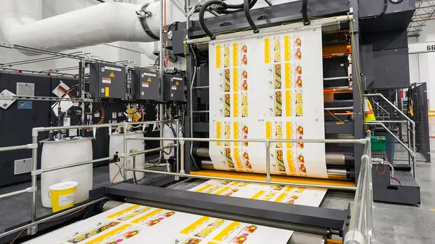
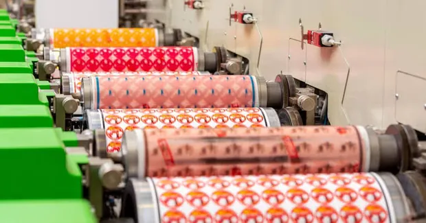
The process is set by quantity, board and fine detail. Here is the honest trade-off, so the run and the board settle the choice.
Short runs, no plate
Best for: Tests, drops and market launches — each box can carry different data.
Volume on corrugated
Best for: Mailers and corrugated boxes where board texture matters more than a 5-pt rule.
Fine detail on carton
Best for: Retail cartons and rigid gift boxes where the finish carries the brand.
A gift box and an e-commerce box should not finish the same way. Here is each effect, what it costs in the run, and where it earns it back.
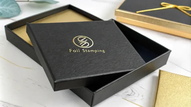
A metal or pigmented foil pressed in with heat. The most premium read per square centimetre — the one finish that photographs as luxury.
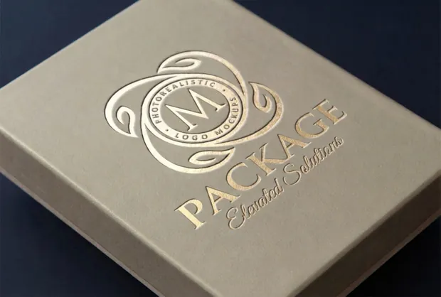
The surface raised or sunk to catch the light. Tactile without adding a layer — a quiet mark of craft on a gift box lid.
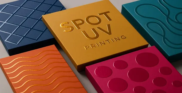
A high-gloss clear varnish on one area, matte everywhere else. A small area of shine that costs little and sells the pack on a shelf.
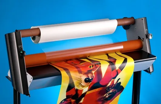
A thin film over the whole sheet — scuff-proof, richer colour, and a matte option that reads high-end. The everyday workhorse.
A velvet-matte coat. A dry, high-end hand-feel that also hides fingerprints — the flavour of a rigid box without the film.
Send a design or a brand manual and get a creative direction back — before the run is committed.
Most ‘looks right on screen’ files fail on the press. These are the specs that keep a file out of the rework pile.
A supplier needs the dieline, the bleed and the separations to match — and the key visual, the codes and the inside print in the right zones. Hand over a file that already accounts for them and the first proof is the one approved.
CMYK drifts between presses. Pantone holds. Here is how the brand colour stays the same on the first box and the ten-thousandth.
The brand colour is locked to a Pantone reference and proofed against it — not eyeballed off a monitor.
A contract proof or a printed drawdown is signed before the plate. That proof is the colour approved — and the one a run is held to.
Ink density, colour and coating are measured and logged per batch, so a reorder matches the last run, not a new guess.
A finish can be ruined by the fold it lands on. A few rules keep the artwork and the box agreeing — the rest is structural engineering.
A transparent path with input at every turn — balanced against the speed and quality a launch needs.
A free session on the brand story, audience, products, palette, material and budget — a clear creative direction before any artwork.
Two to three directions sketched inside the studio, shared as mood boards with the pattern, type and style that fit.
High-fidelity digital drafts in Adobe Illustrator, with the pack size, print spec and sustainability factored in.
Reviewed on a secure platform with annotations; changes land within 48 hours, over one or two rounds on colour and elements.
Print-ready files, a digital simulation and a physical prototype. Approval carries full IP ownership.
Files go to the print partners with production guidelines and a brand asset kit — including the vector sources.
Artwork sits on a dieline. If the box isn’t set yet, start with structural engineering, then come back for the artwork.
Go to structural engineeringStarted in 2015, LeelinePackage is the custom-packaging partner for brands, retailers and DTC businesses — protecting the product and impressing the customer, from the first dieline to the final mile.
Prove the artwork on a physical sample — a white dummy for fit, a printed prototype for colour and finish.
Go to sample & prototypingThe practical questions before a project starts. Structure and sample detail live on their own pages.
A brand manual, a logo, a high-res export or a printed pack — plus rough dimensions and a quantity. That is enough; anything on top is redrawn to vector here.
Usually. The logo and headline are redrawn to vector and the layout rebuilt to the dieline, then a print-feasibility check shows what is fixable before committing.
A first proof usually lands within a few days, and small revisions within a couple of days. The timeline depends on how much needs redrawing, not on the run size.
Work starts from existing brand guidelines and artwork. With only a logo or a rough idea, the packaging artwork is drawn around it — the broader brand identity stays separate.
A one-off setup plus any plates or tooling the finish needs, then a per-unit price that falls as quantity rises. The quote lists each line, so the total is clear before committing.
Ownership stays with the buyer. The artwork and dieline are the buyer’s files, a master is kept for reorders, and work is held under NDA on request.
Upload an existing design or brand manual — get a print-feasibility check and a 3D mockup back before the run is committed. A single partner from the first concept sketch to the press line, so nothing is lost between design and print.