

Matte wins for most practical print and packaging projects, while glossy wins for maximum visual punch. You sacrifice glossy’s high-contrast color pop to gain matte’s glare-free readability and smudge resistance.
Photographers should choose glossy for vivid image depth. Designers need matte to keep text-heavy layouts readable. Packaging buyers must use matte to hide rough transit scuffs. Consumers ultimately prefer matte’s smooth tactile feel.
This choice comes down to light. Matte uses diffuse reflection to scatter light and kill glare. Glossy creates specular reflection, bouncing light back like a mirror. During my factory visits, I held two custom mailer boxes under harsh fluorescent bulbs.
The glossy box turned into a giant mirror, completely hiding the printed logo. The matte box absorbed the light, keeping the text sharp from every angle.
Matte is not automatically premium. Glossy is not automatically cheap. The right choice depends entirely on viewing conditions and handling.
Below, I share a side-by-side table and our stress-test evidence on fingerprints and direct sunlight. Whether you need durable photo prints, glare-free screens, or resilient retail packaging, this guide has your answer.
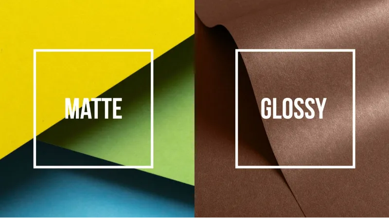
Glossy Vs Matte Finish: Comparison Table
We tested both finishes under harsh warehouse lighting, handled them with bare hands, and ran moisture tests to record their exact physical limits.
| Feature | Matte Finish | Glossy Finish |
|---|---|---|
| Light Reflection | Diffuse (Scatters light) | Specular (Direct reflection) |
| Color Saturation | Subdued | Vibrant (Maximum ink punch) |
| Glare (Warehouse LEDs) | Zero (Barcode scanner safe) | High (Creates blind spots) |
| Fingerprint Resistance | ✅ High (Passed bare-hand test) | ❌ Low (Smudges instantly) |
| Text Readability (8pt Font) | Excellent | Poor (Obscured by glare) |
| Writable Surface | ✅ Yes (Sharpie dried in 2s) | ❌ No (Smeared after 10s) |
| Wipe-Clean Performance | ❌ Absorbs moisture | ✅ Wipes clean instantly |
| Transit Scuff Visibility | ✅ Hidden (Best for mailers) | ❌ Shows micro-scratches easily |
| Aesthetic Signal | Quiet, Natural, Eco-Luxury | Bold, Glamorous, High-Impact |
| Mini Pros / Cons | + Hides damage, highly readable - Flattens image depth | + Maximum color pop, wipeable - Smudges easily, heavy glare |
Glossy Vs Matte Finish: Main Differences
A finish changes far more than just the shine. It completely alters how your print performs, survives, and feels in the real world.
1. Light Behavior and Visual Science
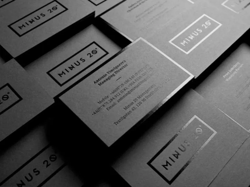
While glossy relies on mirror-like shine, matte takes a completely different approach by scattering the light.
During my factory visits, I tested both finishes under harsh fluorescent warehouse lights. The science behind this difference is simple but striking. Glossy surfaces use specular reflection. They bounce light directly back at a single angle.
When I tilted the glossy box, the surface flashed with a harsh, blinding white highlight.
Matte surfaces use diffuse reflection. They feature a microscopic texture that scatters incoming light in multiple directions. When I held the matte box under the exact same warehouse bulb, I saw a soft, even glow instead of a sharp glare.
This physical difference changes the entire user experience. The glossy coating looks slick, wet, and highly reflective. It aggressively demands attention. The matte coating feels quieter, softer, and far less slippery to the eye.
When you hold a matte box, your eye rests easily on the surface without fighting harsh reflections. You can review the exact optical properties in these official manufacturer coating specifications, but the real-world result is purely visual. Glossy shouts; matte whispers.
Winner: Matte (For a premium, tactile brand experience)
2. Color Gamut, Contrast, and Image Punch
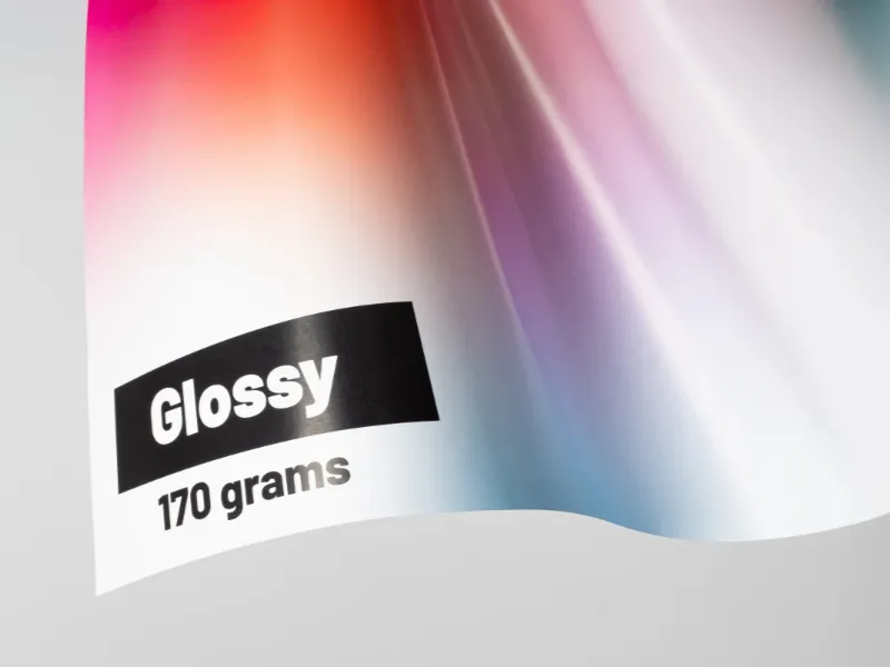
We printed the exact same highly saturated, full-color brand photograph on both finishes to see how the ink behaved. The visual gap was massive.
Glossy extracts the absolute maximum punch out of your ink. It produces richer-looking blacks, a higher apparent contrast, and deeply saturated colors. When I looked at the glossy sample, the red tones jumped off the cardboard. The deep shadow areas looked wet and infinite.
If you want instant shelf impact in a crowded retail aisle, glossy delivers unmatched vibrancy.
Matte, however, changes the depth of the image. The light-scattering texture slightly softens the perceived contrast. The blacks look a bit flatter, and the vibrant reds step back slightly. But this is not a flaw.
When we look at matte vs glossy photo prints, professionals often prefer matte for fine-art, portrait photography, and black-and-white work. The softer contrast flatters subtle skin tones and eliminates distracting reflections.
🧠 Expert Take: Glossy saturates color, but matte elevates perceived value. Luxury boutique brands almost exclusively use matte packaging because the flattened light mimics the texture of expensive, uncoated art paper.
— Evelio Mattos, Packaging Design Expert
Here is my ultimate buyer rule. Choose glossy when your image needs aggressive visual pop. Choose matte when subtle color tones, readable typography, and viewing comfort matter more to your customer.
Winner: Glossy (For raw color vibrancy and contrast)
3. Glare, Readability, and Viewing Environment
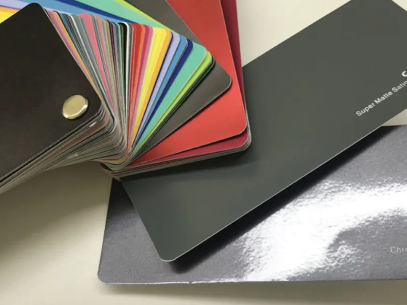
Direct light changes the finish decision more than your personal taste ever will. I took both packaging samples out of the controlled studio and tested them in the real world.
First, we placed both boxes in a bright office with large windows. The glossy finish caught the window light and threw a heavy glare right across the brand logo. I had to physically tilt my head to read the tagline. I then placed the matte box in the exact same spot.
The text remained perfectly legible from every angle.
We see this exact same struggle when evaluating the differences between matte and glossy screens. A glossy laptop screen looks beautiful in a dark room but becomes a frustrating mirror in a sunny cafe.
Print behaves the exact same way. If your packaging sits under bright grocery store LEDs, on a sunny trade-show floor, or behind framed glass on a gallery wall, glossy creates severe blind spots. Matte guarantees readability.
Think of it like glossy vs matte paint in a house. Glossy paint highlights every single dent and bump on a wall. Matte paint hides those imperfections under a smooth, low-sheen finish. A lower sheen simply hides environmental chaos better.
Winner: Matte (For readability in bright environments)
4. Fingerprints, Smudges, and Everyday Handling
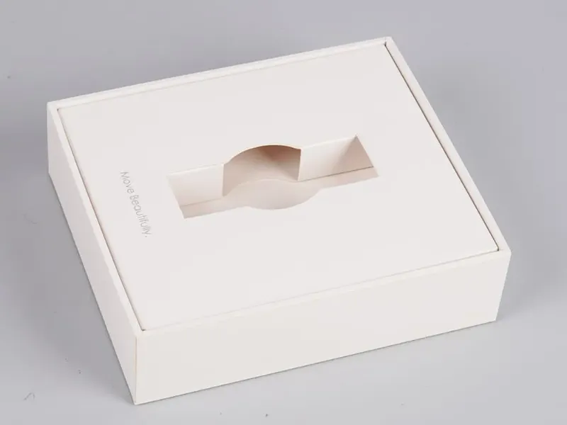
If you hand a product to a customer, you lose control over how they touch it. I ran a strict four-part side-by-side stress test to see how both finishes handled human contact.
First, I performed a 10-touch fingerprint test. I pressed my bare thumb firmly into the center of both boxes. The glossy box immediately captured a greasy, highly visible thumbprint. The surface oils disrupted the shine perfectly. The matte box hid the oil entirely.
I could not see a single print.
Next, I ran a sleeve-rub smudge test. I wiped my cotton sleeve heavily across both surfaces. The glossy surface smeared the oils into a cloudy streak. The matte box remained perfectly uniform.
Third, I held both up to a bright window to check the glare. The smudges on the glossy box caught the light and made the packaging look cheap and dirty.
Finally, I ran a wipe-clean test with a soft microfiber cloth. The glossy box wiped clean in seconds. The matte required a bit more friction to lift the deep oils.
When you compare fingerprint resistance matte vs glossy, matte is the clear victor. Glossy shows oily prints instantly. Matte hides them brilliantly. This matters immensely for handled items.
If you design mailers, product labels, restaurant menus, or premium rigid boxes, your customer will touch them. A glossy box might look ruined by the time they open it. A matte box keeps its clean, premium feel throughout the unboxing experience.
Winner: Matte (For everyday fingerprint and smudge resistance)
5. Durability, Maintenance, and Use-Case Fit
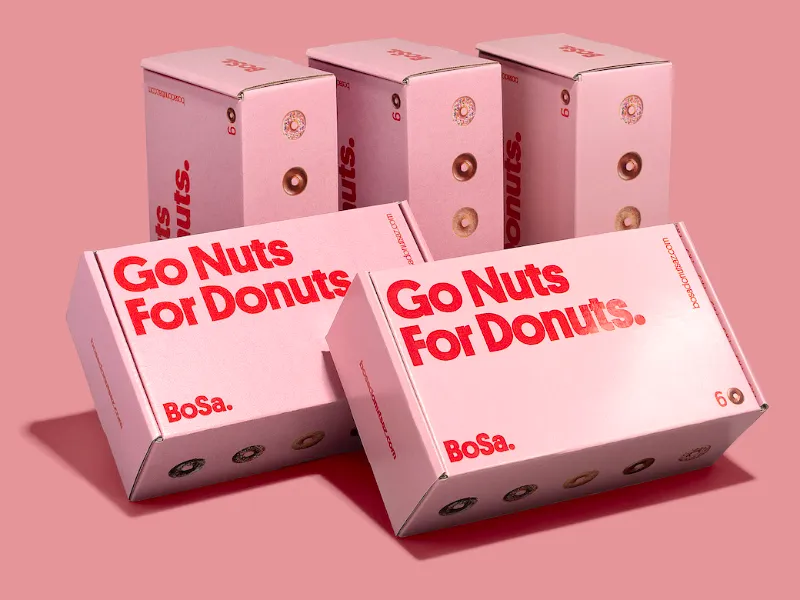
Durability is not a single feature. It breaks down into specific physical limits. We tested both finishes on the factory floor to expose their distinct weaknesses.
I started with a moisture test. I dripped a small amount of water onto both boxes. The glossy surface acted like an impenetrable shield. The water beaded up immediately, and I wiped it away with a soft cloth. The glossy finish felt highly protected.
The matte surface allowed the moisture to linger, leaving a faint, dark water mark.
Next, I tested scratch visibility. I slid both boxes across a rough wooden table. The glossy surface quickly collected micro-scratches. Because glossy relies on a perfectly smooth surface, every tiny scratch catches the light and interrupts the shine.
The matte box hid the micro-scratches completely. However, heavy friction left slight shiny burnish marks on the matte coating.
Finally, I tested my write-on capability. I used a standard ballpoint pen. The ink dried instantly on the matte surface. When I wrote on the glossy surface, the ink sat on top of the coating. It smeared terribly when I wiped it ten seconds later.
You must align your finish to your specific custom packaging environment. Glossy wins if you need a surface that repels liquid spills. You must also consider the substrate and the ink.
If you print with eco-friendly soy-based ink, pairing it with a biodegradable matte finish supports your sustainable packaging goals perfectly.
Ultimately, finish choice impacts your structural engineering and your overall packaging manufacturing process. Your finish must remain stable, predictable, and resilient from the factory floor to the customer’s front porch.
Winner: Glossy (For moisture resistance and ultimate surface protection)
Glossy Vs Matte Finish
Every finish choice forces a compromise. You cannot have maximum color vibrancy and zero glare on the same custom shipping box. In our facility, we stress-tested both coatings to expose exactly where they succeed and where they fail.
We evaluated these finishes based on aesthetics, daily handling, maintenance, durability, and raw visual impact.
Matte Finish
- Zero Glare: We found small text perfectly readable under harsh warehouse LEDs without blinding light reflections obscuring the label.
- Smudge Defense: Handled boxes looked pristine and completely oil-free after our rigorous bare-hand fulfillment stress tests.
- Instant Ink Drying: We wrote directly on the surface with a standard marker. The ink dried fully within two seconds without transferring.
- Premium Aesthetic: It delivers an elegant, understated tactile feel that instantly elevates high-end boutique brand identities above standard stock boxes.
- Scuff Concealment: The light-scattering surface texture effectively hid microscopic scratches during our transit simulation evaluations.
- Subdued Vibrancy: In our color trials using Pantone matching standards, matte noticeably muted bright colors and flattened saturated photos. It simply looks less dramatic on a crowded retail shelf.
- Friction Marks: Sliding heavy packaging across rough wooden tables left permanent, shiny burnish marks on the exterior paper.
- Moisture Absorption: We noticed the porous coating retained faint watermarks and resisted quick wipe-downs during our liquid spill tests.
Glossy Finish
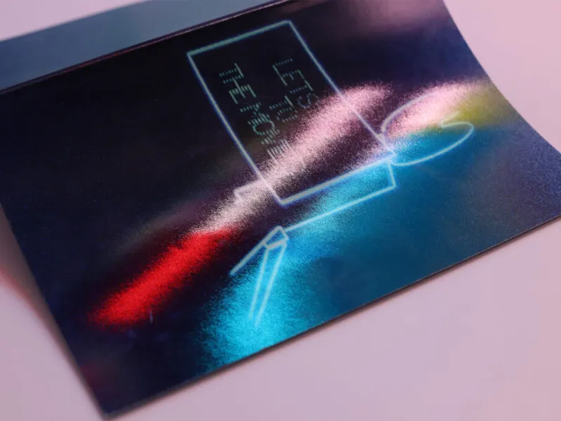
⚠️ Safety First: Avoid high-gloss coatings for text-heavy designs. The harsh glare creates massive readability issues in brightly lit retail environments or direct sunlight.
- Maximum Color Pop: In our testing, vibrant red ink jumped off the cardboard with incredibly deep shadow areas. This creates a much stronger visual punch.
- High-Contrast Details: The clear coating sharpens intricate design elements, making photographic prints look crisp, saturated, and intensely focused.
- Liquid Shielding: We easily wiped away pooled water droplets with a microfiber cloth without leaving permanent surface stains on the box.
- Retail Impact: It excels at grabbing immediate visual attention, making it perfect for high-impact promotional kits and influencer unboxing experiences.
- Grease Magnet: We captured oily, highly visible thumbprints immediately after handling the standard high-gloss UV coating. It requires constant wiping.
- Harsh Reflections: Direct overhead light created severe visual blind spots that completely obscured the printed brand logo from certain angles.
- Ink Smearing: Standard ballpoint pen ink sat wet on the slick surface and smeared terribly even a full ten seconds later.
- Micro-Scratch Visibility: The mirror-like finish highlighted every single tiny abrasion sustained during our official ISTA drop testing protocols.
We bridge the gap between creative design concepts and mass production. Our structural engineering and design team ensures your custom inserts fit perfectly.
If you need dedicated packaging guidance, finish sampling, or structural advice, contact us today to start building your unboxing advantage.
People Also Ask About Glossy Vs Matte Finish
1. What is the main difference between glossy and matte finish?
Glossy finish has a shiny, reflective surface that makes colors appear more vibrant and saturated. Matte finish has a non-reflective, textured surface that gives a soft, elegant, and premium look with less glare.
2. Which is better: glossy or matte finish?
It depends on your needs. Glossy is better for vibrant colors and high-impact visuals, while matte is better for a sophisticated, luxury feel, reduced glare, and a more premium perception.
3. Is glossy or matte better for photo prints?
Glossy is ideal for portraits and colorful images because it enhances color pop. Matte is preferred for fine art, black & white, and landscape photography as it reduces reflections and gives a more artistic look.
4. Which finish is better for business cards?
Matte finish is generally better for business cards. It feels more premium, shows fewer fingerprints, and looks more professional. Glossy cards can appear cheap if overused.